Yale School of Arts
Redesigning the Yale School of Arts' website
Tools

My Role
UX Designer
Time
1 month
Project Overview
The Yale School of Art's Wiki website, intentionally designed as an experimental platform for collaborative content creation, presents significant usability issues. Its cluttered homepage, distracting aesthetics, and dense, unstructured content hinder user experience, making it challenging for students, graduates, staff, and applicants to access critical information and navigate the site effectively.
Project Goal
The primary goal of this project is to redesign the Yale School of Arts website to enhance its usability, visual appeal, and alignment with the institution's goals and values. The redesigned website aims to provide an improved online experience for its diverse user base, including students, faculty, staff, prospective students, and the broader community.
{01} — Heuristic Evaluation
Conducting a heuristic evaluation was the initial step in the redesign process for the Yale School of Art's website. By applying Jakob Nielsen's 10 Usability Heuristics, I systematically assessed the site's usability to pinpoint design issues.
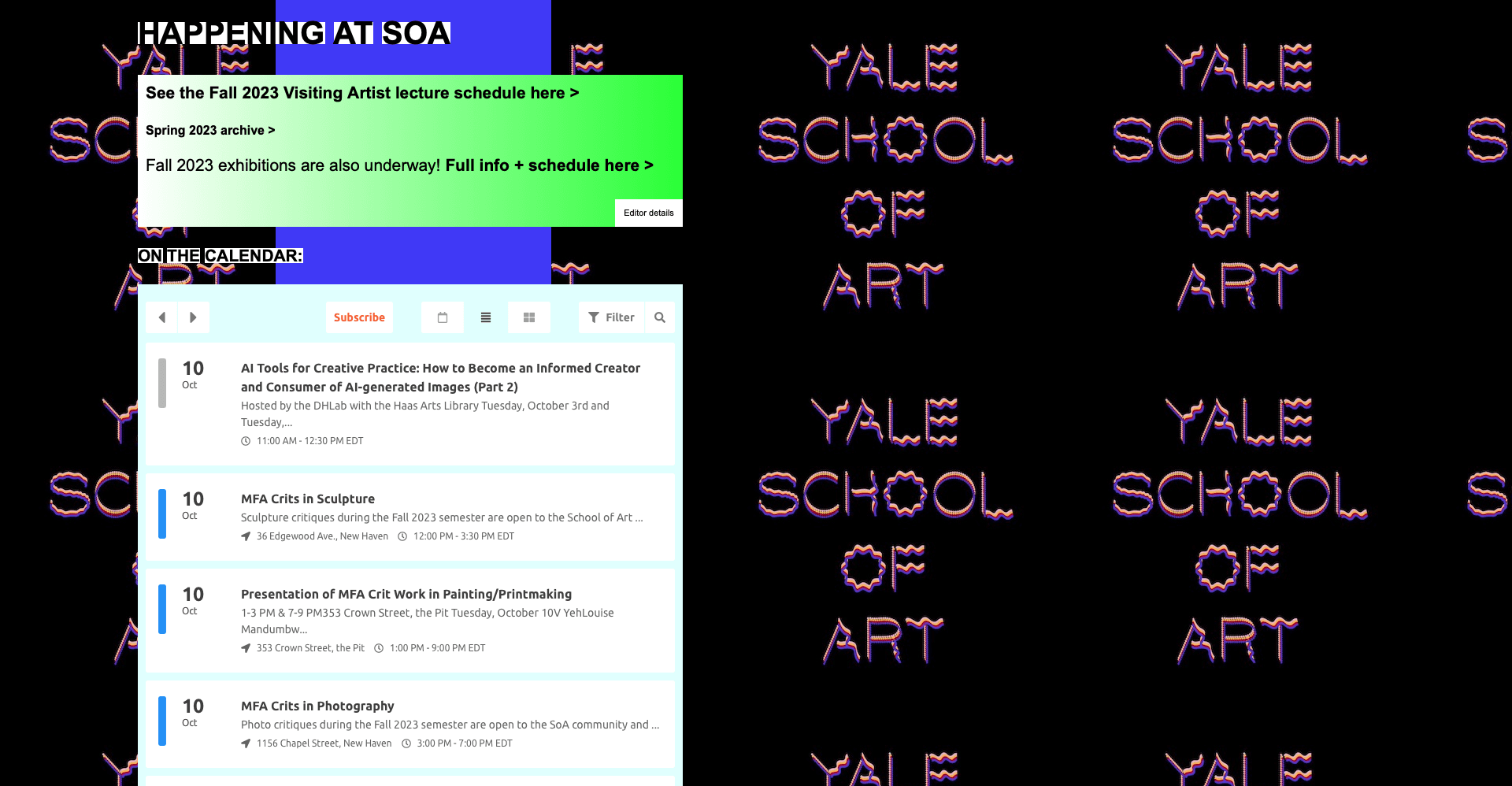
Consistency and Standards
There is a notable break from the "Consistency and Standards" usability heuristic by lacking a specific and coherent color palette. The absence of a consistent color scheme can make the website more challenging to read and navigate, causing cognitive dissonance for users. Inconsistent colors can disrupt visual harmony, creating distractions that hinder user engagement and focus. By implementing a standardized color palette, the website can achieve a more coherent and visually appealing design that enhances readability, user experience, and overall aesthetics.


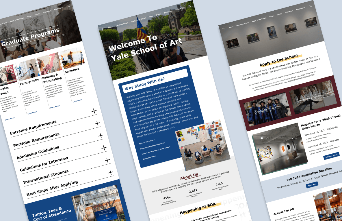
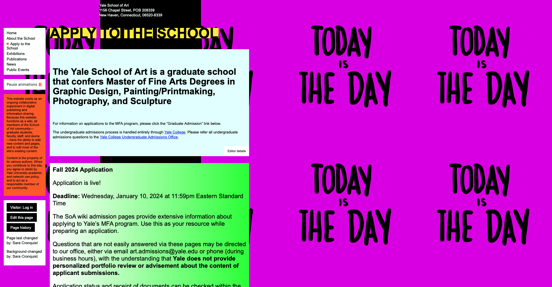
Apply To The School Page
On another page, "Apply to the School", we see the same issues as on the home page. As in the home page, having a crowded & continuous background pattern in the creates a chaotic design. The location of the navigation bar is also small on the side of the site, which does not suit the mental model of the users. The lack of a consistent color palette does make navigation and reading difficult.
{02} — User Persona
Developing a user persona for the Yale School of Art's website was a pivotal step to humanize and understand the needs of the target audience. Understanding David's motivations and pain points allowed for a more empathetic and tailored design strategy, ensuring that the renewed website would reflect the real experiences and expectations of potential users.

{03} — User Journey Map
Creating a user journey map allowed me to tell a cohesive story of the user experience, from initial exploration to program discovery, financial considerations, and the application process. This visual narrative connected seamlessly with my prior user persona creation, grounding my design decisions in the real-world needs and emotions of users like "David".

Click on the image to see full size
{04} — Information Architecture
After conducting a heuristic evaluation, creating a user persona and a user journey map, I recognize that there is a need for a solid foundation before diving into the design details. By creating an information architecture with a clear structure and hierarchy, I aimed to address issues identified in the heuristic evaluation and provide a more user-friendly platform.

Click on the image to see full size
{05} — Design Systems
In the design system phase, I incorporated Yale University's colors for a touch of institutional continuity. The chosen Verdana typeface, a humanist sans-serif known for its readability on digital screens, aligns with contemporary web design standards. The palette and typeface blend tradition with modern usability, providing a visually cohesive and user-friendly experience on the Yale School of Art's website.


